Hey all you Mega Man fans! Are you ready for another mapping compo?
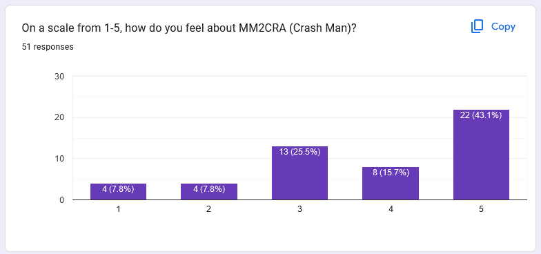
 "Bounty" is a map competition aimed at replacing four maps for future versions of MM8BDM: MM2CRA, MM6WIN, MM2FLA, and MMWTMWS.
Download here: https://allfearthesentinel.com/zandronum/download.php?file=mm8bdm-bounty-full-v1a.pk3Without further ado, the rules are as follows:
Prizes:- Highest scored maps of each stage will replace the current core map.
- Highest scored map overall will be awarded with a MM8BDM Architect Medal for your forum account.
- Other winner maps will warrant a MM8BDM Architect Runner-Up Medal for your forum account.
Signup Rules:- Signups are mostly a formality to help me keep track of everything from an organizational standpoint. 9/10 times I will take submitted maps.
- Signups should be done via this thread.
- You can have others sign up on your behalf, so long as they include a full copy of your signup and you are not banned from the forums.
- Signups should include the following: your name, and which maps you are signing up for.
- You can sign up and submit at the same time.
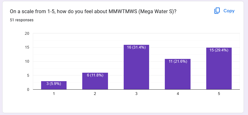
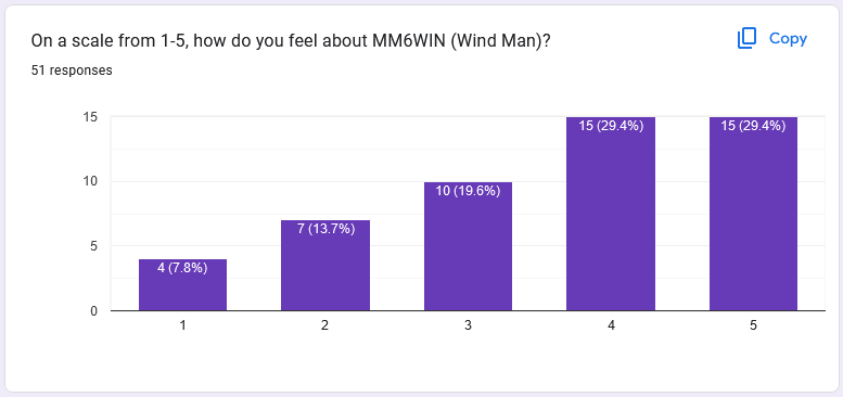
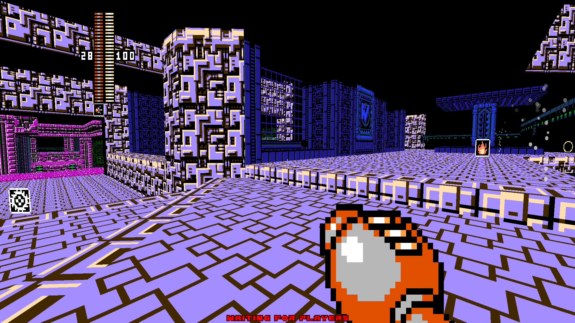
- You must sign up only for the following maps: MM2FLA, MM2CRA, MM6WIN, MMWTMWS.
- You can edit your signup, but inform me if you do so.
Name: Shadowgate
Maps: MMWTMWS, MM6WIN
- A submitted map must be made by you. If you choose to partner with another mapper, they must submit the same wad as you.
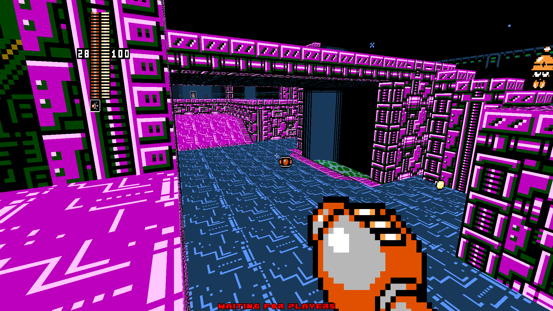
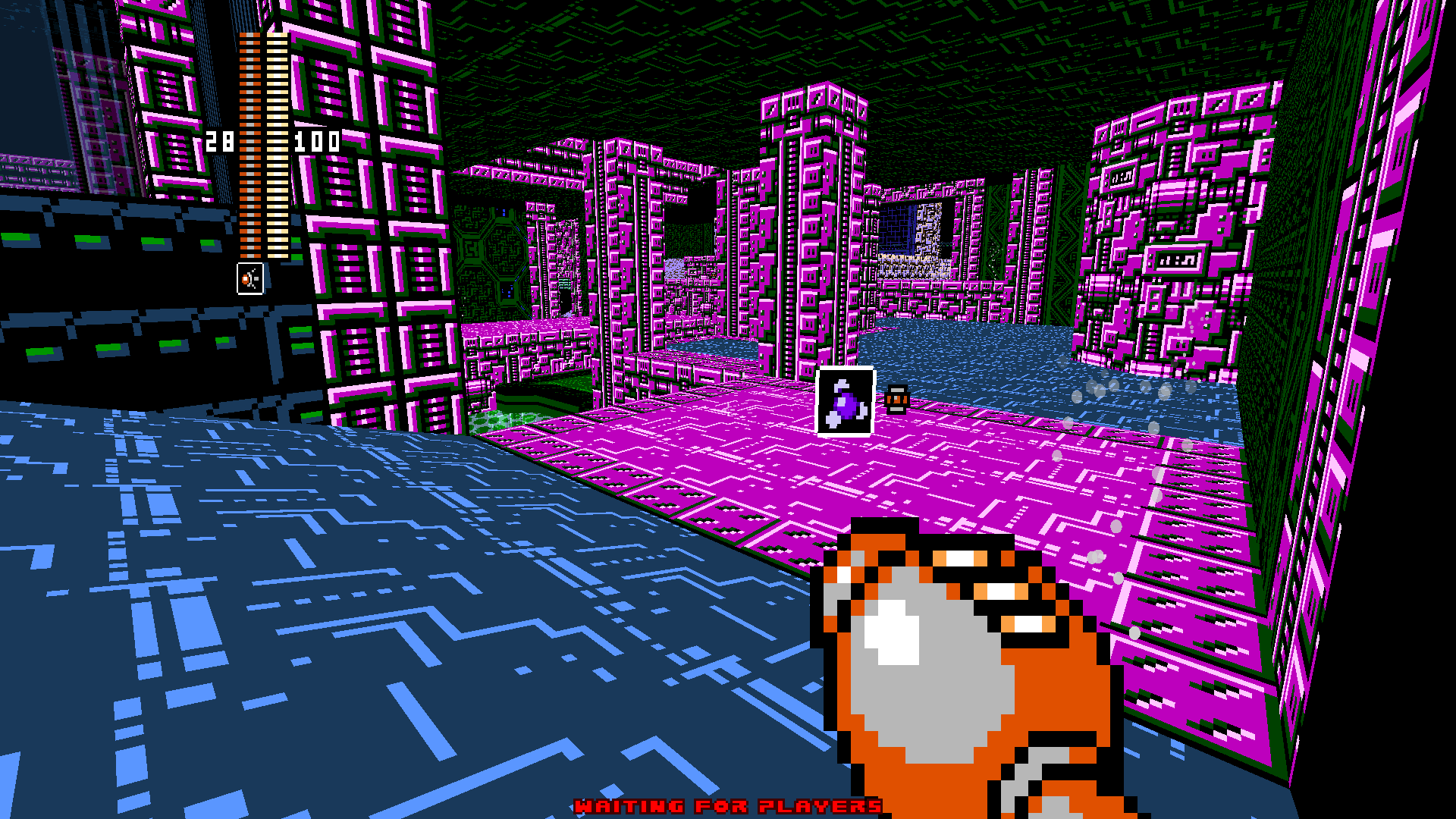
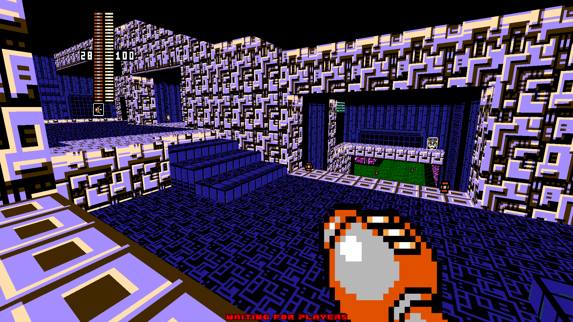
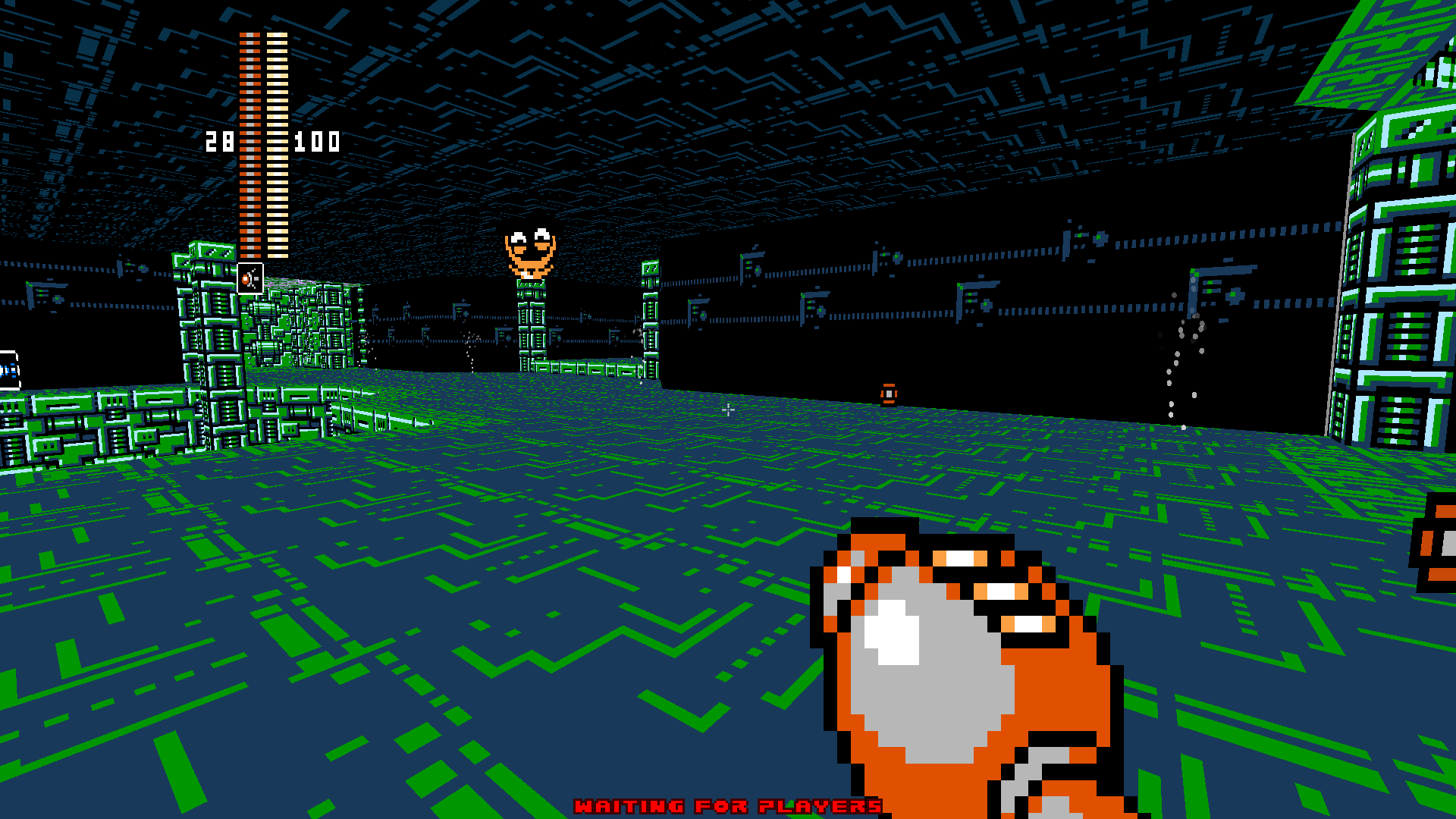
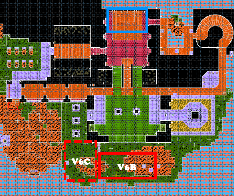
- Maps must be in standard MM8BDM format, and should be designed as if they were MM8BDM v6b maps. For more details on what that all entails, check the spoiler below.
Doom Builder Format
- Game Configuration = Zandronum: Doom 2 (UDMF)
- Script Type = Zandronum ACS
- IWAD = Megagame.wad
- Base .PK3 = MM8BDM-V6B.pk3
MAPINFO
- aircontrol must be 0.5
Spawns
- 32 Deathmatch Spawns
- 16 Light Team Spawns
- 16 Wily Team Spawns
- 8 Cossack Team Spawns
- 8 King Team Spawns
- Player 1-8 starts
Misc
- Map must have 255 brightness across all sectors.
- Diagonal sectors should be either 45 degrees or curved.
- Check the "Block Monsters" linedef action around pit linedefs.
- You should prioritize the textures that are already in the map! But additional textures are allowed so long as they supplement the existing textures
and are easily sourced to a canon Mega Man game.
- New props, including enemy props and gimmicks, may be added. These are subject to the same canon checks that the textures are.
- Custom stage music may be added, but it will not remain if your map is a winner. Boss, intense, and victory themes will be removed instantly.
- Custom content (including props, textures, scripts) must not overwrite any content already in MM8BDM v6b.
Map Submission Rules- Please submit your maps via Cutstuff PM or Discord DM to LlamaHombre. The former is preferred, and maps can be sent via websites like MEGA or allfearthesentinel.
- If somebody else signed up on your behalf, you may submit yourself or through that person.
- Your map must be either a .WAD or .PK3 file containing your map and all added custom content.
- Your file must be no bigger than 5MB.
- Finished maps must be submitted before the deadline: February 1st 2024, 11:59:59 PM EST (Eastern Standard Time).
- Finished maps can be updated and resubmitted before the deadline.
Judging Rules- Maps will be judged according to their general strength as a map for MM8BDM v6b / v6c.
- This means a number of factors and modes should be considered. Deathmatch, Last Man Standing, Duel, Teamplay, etc.
- I'll host testing sessions later, likely focused around DM, Scorched Earth, and Duel to make sure every map is tested thoroughly.
- Maps will be judged on the following categories (
stolen inspired by CMCP/TTT judging...):
A) Layout/Spawns (good map structure, good map flow,good spawns for teamplay, good weapon/energy layout). Worth 50 points.
B) Visuals (good texturing, good art style). Worth 30 points.
C) Authenticity (representative of the original stage. shows both creativity and restraint as needed). Worth 10 points.
D) Functionality (working scripts and no map bugs). Worth 10 points.
- Total score is out of 100 points.
- Judges will have one month to finish scoring, subject to extensions or truncations depending on what is needed.
- If judges suspect a map was made to troll the contest, they can vote to ban the map from the contest. This vote must be unanimous.
Judges- LlamaHombre
- Freems
- King Dumb
- pegg
Old OP and background below:
I almost am. I'm gonna need to ask around a little bit first to get an idea for what everyone wants to see. For some background...
In 2013, Ivory - MM8BDM lead dev at the time - opened up a map competition named
"SWBT". It was a smash hit and resulted in some big upgrades to especially the MM7 lineup of maps.
In absense of a Jam or a Mendez-hosted mapping event this year, I'm stepping up to the plate and attempting to host a "SWBT 2" myself. For a few reasons that will be apparent pretty soon, I am opting to call this sequel compo
"Bounty".
Originally I was set to do this regardless of MM8BDM dev team coordination or not. After all, I am not currently on the team and as far from Ivory's position as one could imagine. However, many talks through Freems and Trillster have granted me grace to promise the following:
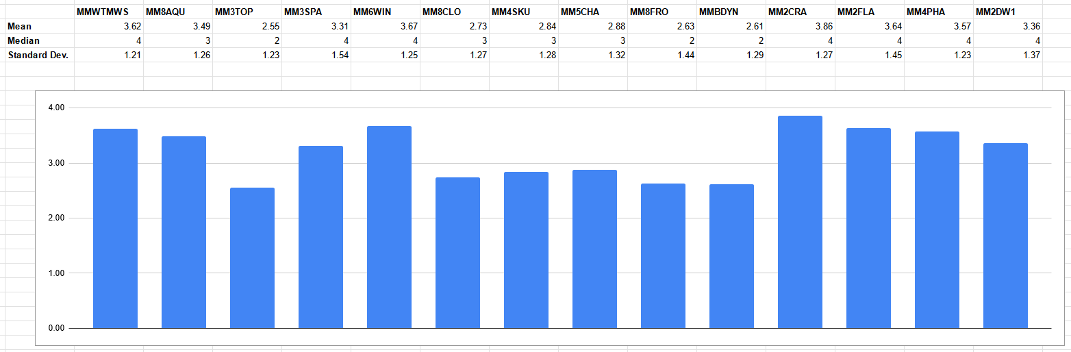
this competition is for potential core map replacements. As a result, I dug a little deeper and polled the team for maps that they would like to see change from. I received a list of 11 maps. This list is a collection of common answers on the devteam to which maps they'd be interested in seeing changes or other takes. Although this is a great start, this is 1) too big of a selection for a reasonable competition and 2) not guaranteed to house every map that could be suspect.
====================
So below, you will find a survey. In my opinion, everyone should take it regardless of whether you intend on competing or not. It will poll you for important information about the aforementioned maps (and give you an opportunity for a write-in vote), and the potential future of this competition.
====================
The current post-survey plans are as follows:
- In around three days I will analyze the results. Either I will have enough to mark a bounty on certain maps and lock them in place, or the write-ins will shake things up enough to where a second survey becomes needed.
- Regardless, I intend to be done with survey hosting by the start of October. From here, I will lock in bounties on 4 maps and select my judges.
- Mappers will have likely the rest of the year to make as many entrants as desired, though like SWBT they will only have one entrant per map. This end deadline is very malleable and may shift depending on mapper turnout and survey results.
- Rules have yet to be drafted, but will likely combine bits of SWBT's and TTT's rulesets both for mappers and judges.
- Maps not selected for "Bounty" may yet get their day... stay tuned.
====================
Thanks for reading, and please answer the survey!
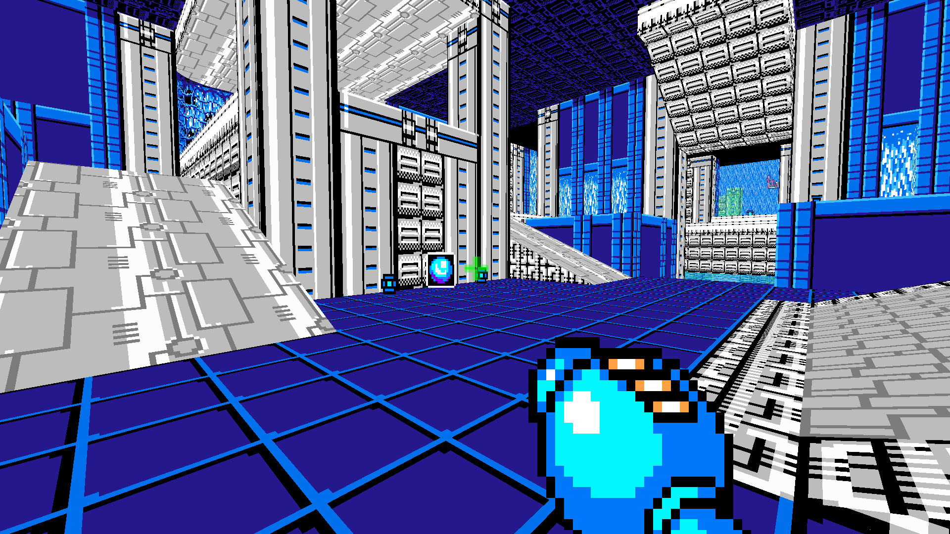
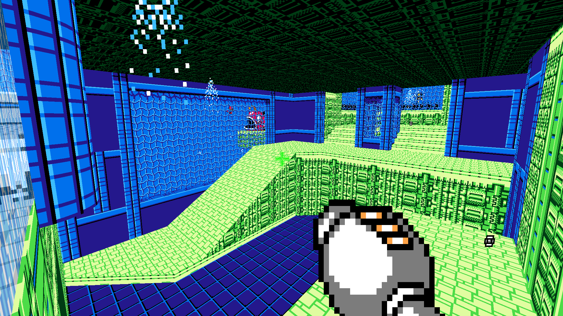
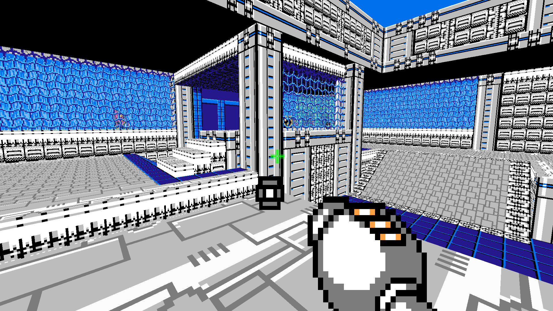
MM2FLA
======
-
Seafra Yeager-
Extus-
Thunderono-
CutmanMike-
Duora Super Gyro-
Mendez-
ForteGigasGospel-
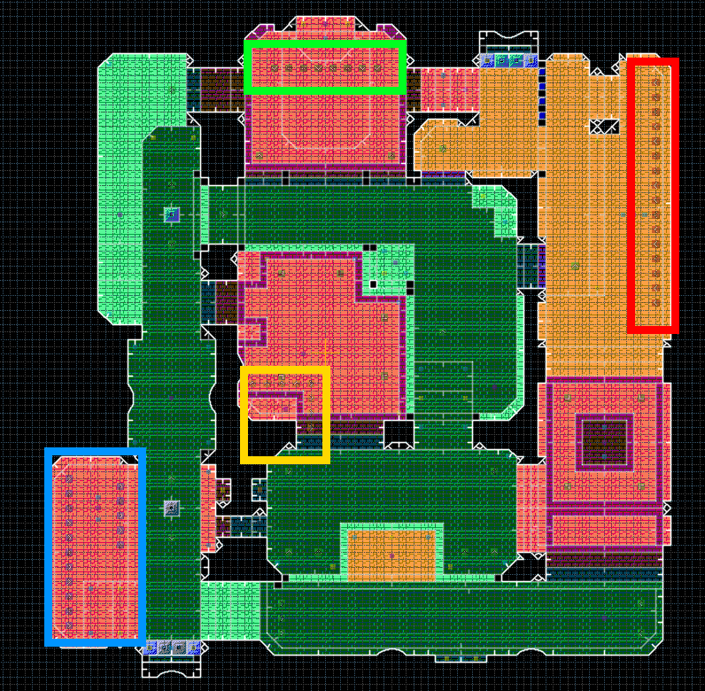
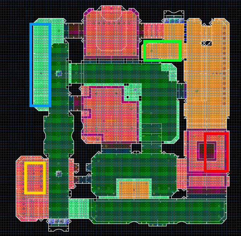
DerekMM2CRA
======
-
Derek-
Duora Super Gyro-
KIWIMM6WIN
======
-
Russel-
Galactan-
Bawby-
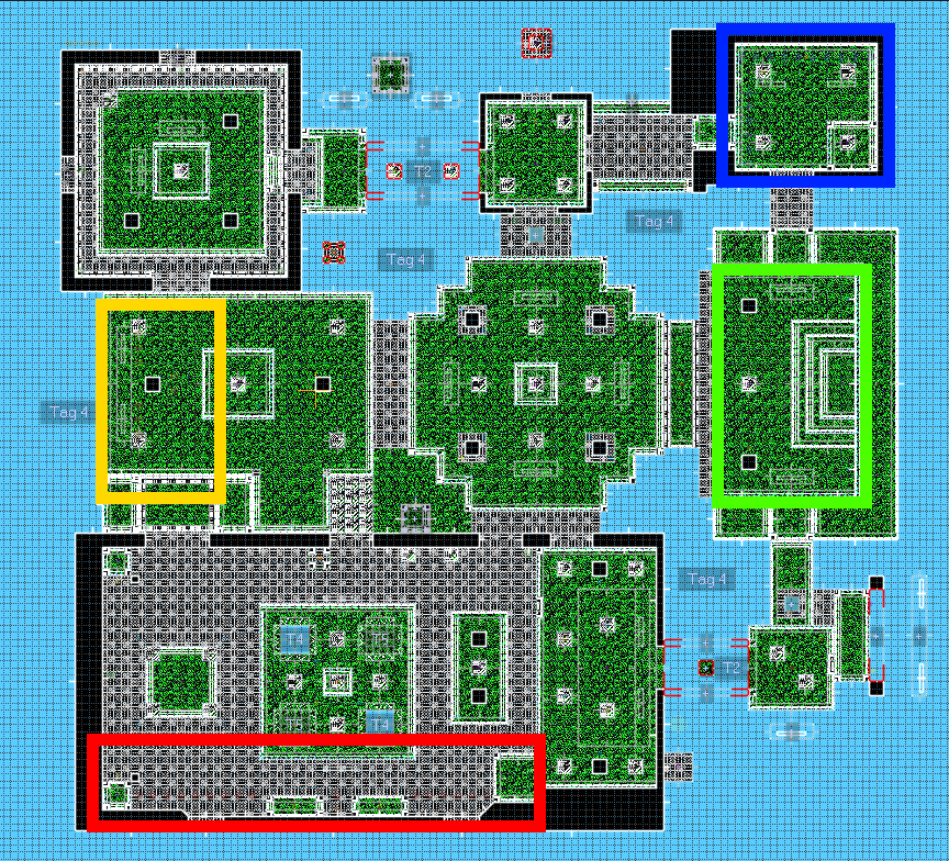
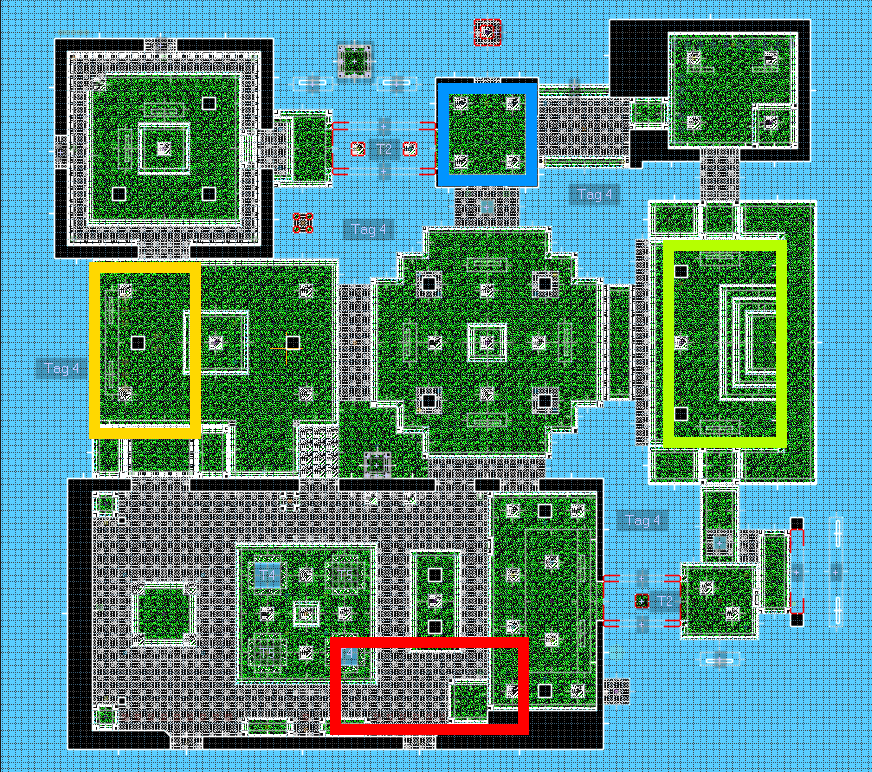
KorbyMMWTMWS (last day Feb 10!)
========
-
Extus-
Duora Super Gyro-
Kapus-
Pr. Gibus-
FTX6004-
KIWI-
RusselMaps and signups above! Submitted entries are given colored names.